
The design of shallow thinking
How the internet’s design choices rewired the way we think


Last week, I was reading one of the many articles about AI’s impact on thinking. Besides making me question my own ChatGPT habit (admittedly a little embarrassing at times), it made me realise something that’s bothered me for years: we’ve been losing our capacity for deep thought long before AI showed up.
As many of us, I grew up online, and along with many other technological shifts, I’ve witnessed the internet going from being a space that inspired reflection to one that actively discourages it. This change didn’t feel like a natural evolution, but among other things, I believe it was the result of design decisions that ended up fundamentally altering how billions of people now think (sounds a bit dramatic, I know, but hear me out).
When the internet felt like a place
I was born in the 90s, and a standout part of the zeitgeist of the time was how the internet felt like a place. One reason was that the internet wasn’t yet ubiquitous but confined to a specific place in our lives — which in most cases meant the ‘family computer’. We even had a distinctive sound associated to that place, which much like the first ring of the school bell signalled to us that we were readying ourselves to enter somewhere.
The place metaphor was also reinforced by the language built around the internet: having a ‘home’ page, website ‘addresses’, ‘going’ online, and ‘browsing’ a page like wandering through a physical location. Some of the first mainstream browsers had names that related to travel and discovery, like ‘Netscape Navigator’ or ‘Internet Explorer’, which quite explicitly suggests there’s uncharted territory to discover. Even ‘Safari’ (though slightly later) continued this exploration metaphor.
When the web felt like a place, it borrowed the affordances of places as well: doors, rooms, corners, and edges. We went there, opened a door, entered a room to research, communicate, or discover, and then back out again somewhere else.

The smartphone shift
Then along came the smartphone, seemingly putting the internet into our pockets but in reality accelerating a shift towards it becoming ambient and ever-present. Now, with everything available at our fingertips at any time, those affordances have flipped.
Feeds with infinite scroll (and essentially endless content) erased edges, there’s no more doors to open as we rarely log out in the first place, and with notifications alerting us of anything new, we’ve lost many of those stopping cues that helped with giving us cadence and allowed for more deliberate time spent perusing and in depth.
This sense of the internet as a destination created a different relationship with digital content as well, one that encouraged lingering, exploring, and sustained attention rather than quick consumption. This was also strengthened by what was available on the internet at the time in terms of products: many of them felt purposefully designed for that, maybe as a nod to the initial purpose for why the internet was even developed.
Interfaces that invited depth
The clearest way to see how design has shaped thinking is to compare the interfaces themselves — just a few examples of the spaces where I spent most of my formative digital years: Blogger and LiveJournal gave you huge, blank text boxes to fill with whatever was on your mind, and forums had conversations that stretched on for days or weeks. MySpace allowed you to personalise your page with graphics and music, down to the 8 friends you wanted to feature on your profile.
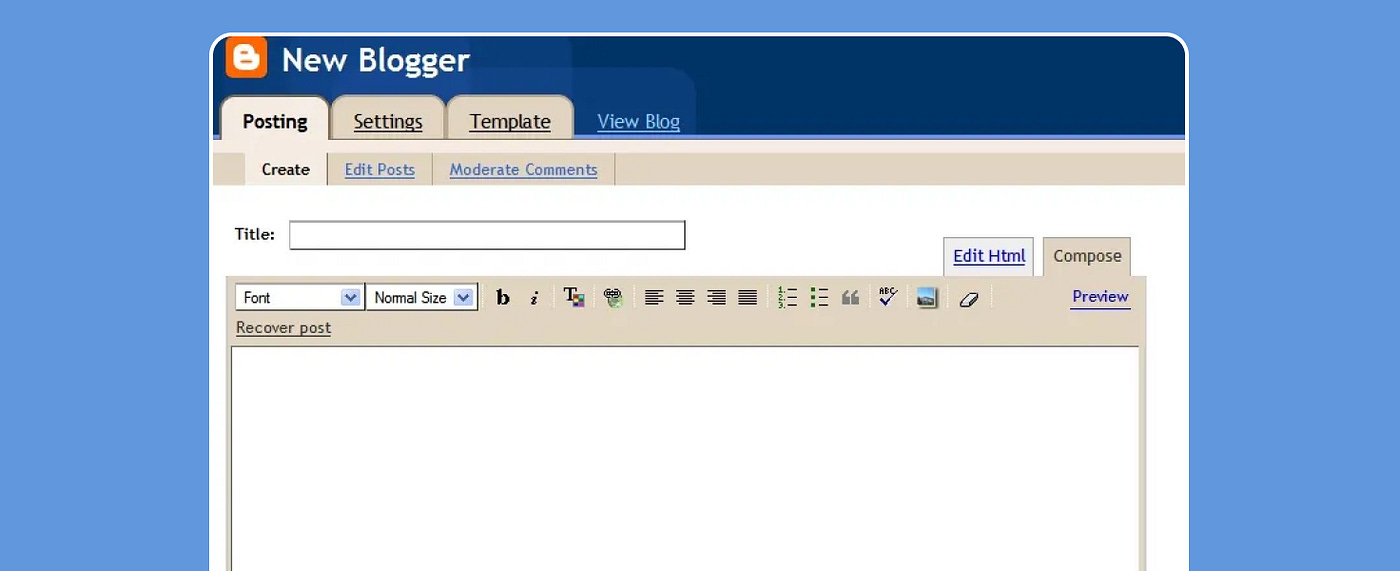
What most of these spaces had in common was the way they were designed: no character limits telling you to keep it short, no infinite feed demanding constant attention, and where nothing disappeared after 24 hours. What we had were big, empty spaces inviting us to write and think and express yourself — however much we wanted and however long it took.
These spatial changes weren’t just cosmetic; in fact, they’ve had a much bigger impact on us beyond the screen itself as they’ve essentially contributed to rewire how we process information. When we lost edges and stopping points, our brains shifted from exploration to consumption mode. I don’t know about you, but I can feel this in my everyday life. For example, sitting down with a long article, I automatically scan for key points and drift toward the TL;DR section. Chances are you’re scanning through this post right now. Our brains have become reluctant to process long-form content, instead expecting information to arrive in digestible chunks — regardless of whether we might be genuinely interested in the topic or not. And this is just one way in which this cognitive shift manifests as a symptom of how interface design shaped our mental habits.
Three ways we changed
This change shows up in three main areas of how we interact online: how we move around the internet, how we engage with content, and how we consume information.
Millennials like me developed our cognitive habits during the era of “slow internet”: there were no all-knowing algorithms then, we’d actively seek out content, bookmark websites, actually commit to reading full articles, and even took the time to engage with random strangers asking questions.
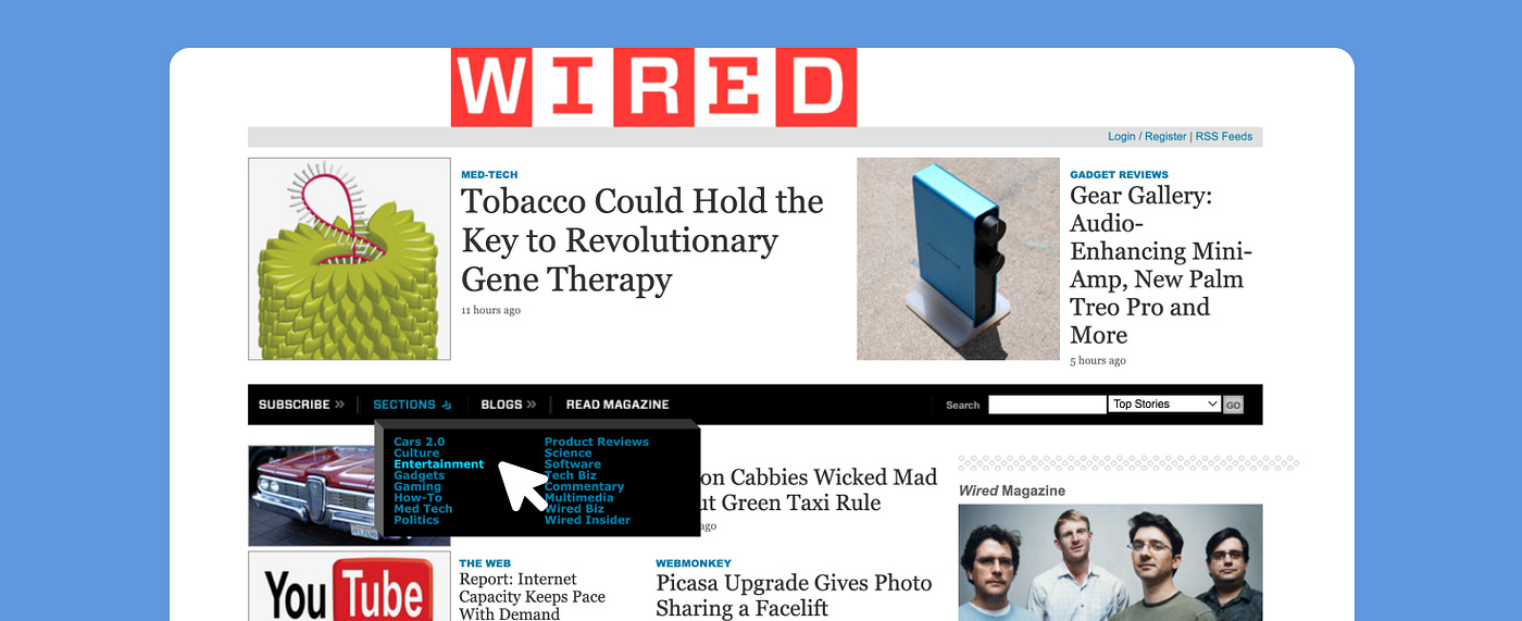
We started with static menus and site maps where we would quite literally choose our path by clicking through categories (like Articles > Technology > Reviews). This process required conscious decisions about what we wanted to explore and consume, a “problem” that algorithmic feeds have solved for us since there’s little to no cognitive work involved now as they present us content based on engagement metrics and (semi)educated guesses based on the data they’ve collected on us.
Comment sections lived at the bottom of articles — we had to finish reading before engaging. Seems like a trivial thing, but it created a natural flow from consumption to reflection to discussion. Now real-time reactions and notifications pull us into conversations before we’ve fully processed the content, fragmenting attention between reading/watching and responding, and truthfully most of the time just bringing us to consume more, absorbing less, and not interacting much at all.
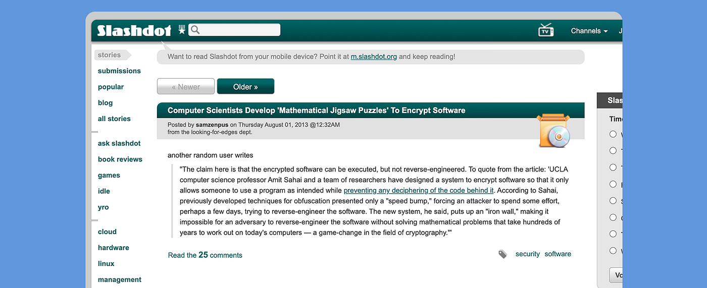
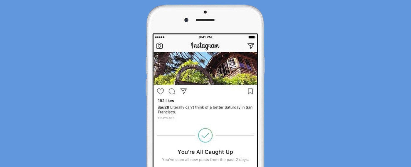
We could catch up easily where we left off. Chronological updates created natural endpoints and a sense of completion which is nonexistent in the newer algorithmic timelines that resurface old content mixed with new in order to never run out. This, and the introduction of more and more ephemeral content essentially eliminated any sense of ‘being caught up’ or natural stopping points.
But how do these changes actually affect our thinking? The clearest example comes from looking at how certain design choices evolve into mental habits.
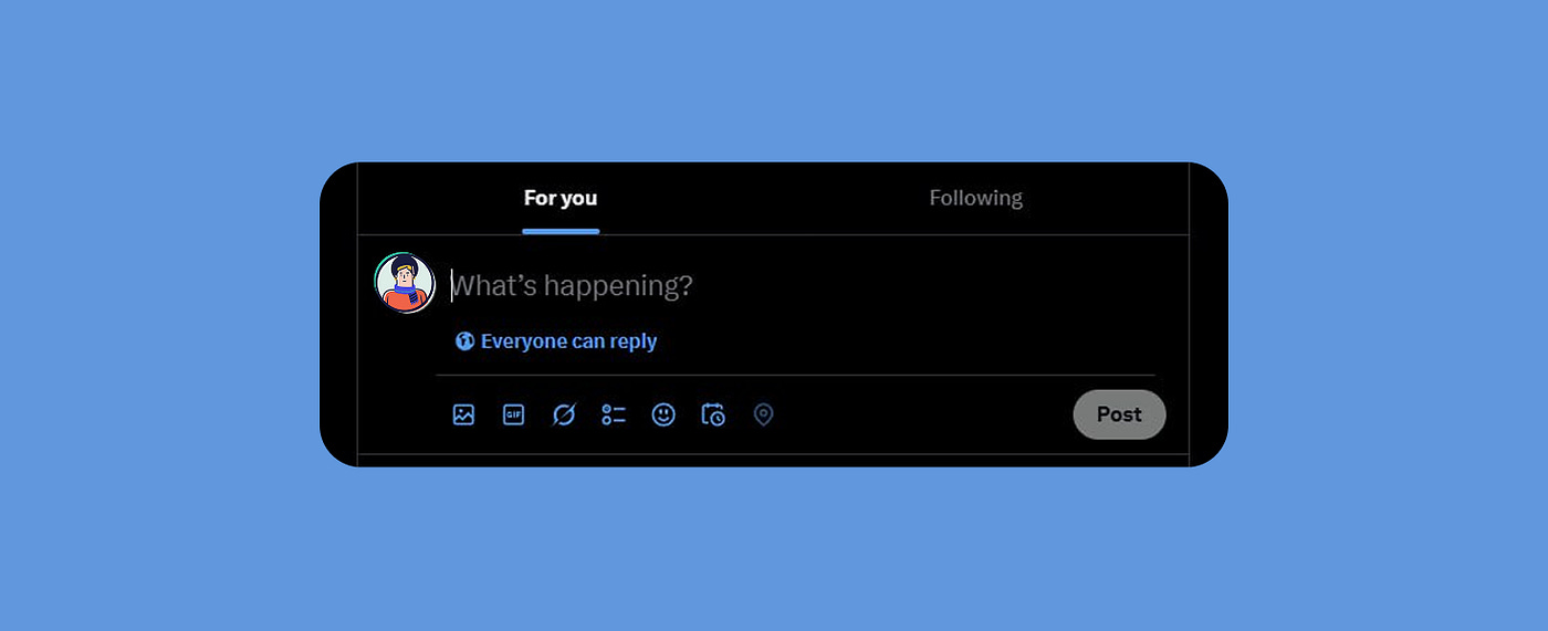
Twitter’s character limit and the compression of thoughts
Let’s take Twitter’s (X, whatever) design psychology in example. Twitter launched in 2006 originally as an SMS-based status update service. At the time, they weren’t trying to make a statement about their philosophy with the 140-character limit as much as it was a hard technical constraint imposed by SMS technology, which allowed 160 characters total (20 characters were reserved for the username).
A limitation that made sense when users were posting via text message from flip phones, and became obsolete when smartphones became the norm. Despite that, it still went on to became the defining feature of the platform embedding itself into Twitter’s visual design and creating invisible cognitive pressure.
The compose window is tiny, and it’s an immediate signal we should keep things brief even before we start typing. If we have a complex thought we want to share, chances are we immediately start thinking about how to compress it down. Compare that to opening a blog editor with a much larger canvas — completely different mental spaces. Most people mentally edit their thoughts before typing, not after, so to an extent, the constraint shapes the thought formation itself, not just the expression.
Something that shows how deeply these constraints have affected us, is what happened in 2017: when they doubled the character limit to 280, user behaviour barely changed. Despite having twice the space, most tweets stayed exactly the same length. We’d been so conditioned by the original limit that we kept to those mental frameworks even when given more freedom, essentially internalising the constraint.
Each design choice creates habits, habits create culture, and culture eventually shapes how we think.
The economics behind the design
This shift didn’t happen overnight, but definitely not organically. What we might think of as natural user preference is actually the result of deliberate product design decisions.
I’m not trying to imply that this transformation was orchestrated by some master plan to make our collective attention span crumble. I’m sure the engineers building the original Twitter’s SMS integration weren’t sitting around saying “let’s rewire human cognition”. But from these technical limitations and product decisions, it went on to stem what has now become the invisible architecture behind how we communicate.
Most platforms aren’t designed for shallow thinking by accident, and we all know that — they’re designed that way because it’s profitable. Especially free products with business models built on ads need our attention, and it just so happens that attention is best captured through fast, compulsive engagement. Deep engagement is actually bad for business. If we’d all spend 20 minutes reading one article and felt satisfied, we’d generate way less ad revenue than if we’d spent those same 20 minutes rapidly consuming post after post. Platforms these days optimise for what’s called “continuous partial attention” — they need us always engaged but never fully absorbed.
Looking through this lens explains why certain products resist features that might encourage deeper engagement or natural stopping points. These would reduce the core behaviours that generate revenue.

The designer’s dilemma
For those of us building these products tho, this can be an uncomfortable spot. As designers and developers, we can tell ourselves we’re simply giving users what they want, or that we’re constrained by business requirements beyond our control. Which can be true to an extent, but it’s a fine line between ‘removing friction’ and removing that resistance that helps people think clearly or have healthy boundaries with our products. Up until what point can we justify practices that have negative consequences on society in the name of “user engagement” and revenue?
The reality is that we can have more influence than we often admit. Every interface decision, from the size of a text box to the timing of a notification, can shape human behaviour. On the flipside, this doesn’t mean we need to abandon good UX principles or make products deliberately difficult to use but it does mean expanding our definition of ‘good design’ beyond metrics like engagement time and trying to educate our stakeholders about why this matters.
What if we measured success by how often users felt satisfied enough to close the app? What does optimising for quality would mean in this scenario? How can we reward time spent thinking rather than time spent scrolling? How can we create spaces that feel worth returning to, not just passing through? And sure, these questions are kind of philosophical, but we can also take them as practical design challenges (and some teams are already trying to tackle them) as we have both the tools and the responsibility to build better.
What depth-oriented design looks like
I don’t think there’s one standard approach that would facilitate a shift towards depth, but the key insight here I think is recognising that digital architecture shapes mental architecture. When we design spaces with edges, we create room for sustained attention. When we build interfaces that respect our time rather than just capturing it, we recover our capacity for the kind of thinking that complex problems require. Removing friction is not always the right answer when trying to get users to engage more, it’s easy and cheap, and not without consequence.
And if you’re able to go past the hint of nostalgic romanticism of my argument, I think we’ll agree that it’s a practical necessity. We cannot lose our ability for long-term nuanced thinking that shallow engagement patterns make nearly impossible. We’re supposed to be able to tackle complex problems with creativity and empathy and to do so we need digital environments that support our minds and foster our ability to pay attention and notice the world around us.
The shallow thinking we live with today isn’t inevitable; the internet felt like a place once because it was designed to be one. And perhaps we can make it feel like a place again by building with intention: if shallow thinking is designed, then depth can be designed too.
I spent way too much time writing this so if you’ve read this far (thank you!) I would love to know your thoughts and where you stand regarding this topic!