
The SAFE Framework: A Systematic Approach to Designing for Trust
Why trust matters and how to design for it

In the early days of my career, I was working on this fintech app that completely changed how I think about design. We'd spent a looong time building what we thought was the perfect homescreen: every feature was accessible, the information was organised nicely, the whole thing looked polished. Our team was quite pretty proud of it, actually.
But when the conversion rates came in… crickets. It didn’t really move the needle in the direction we’d hoped it would.
So we did what you do when things aren't working - we started digging through user interviews, session recordings, the whole thing. And that's when one user dropped a bomb on us: "There's so much going on, I don't feel like I can trust it with my money".
Then another said basically the same thing. And another. Until soon enough, we had a pattern that left us staring at our screens wondering what the hell we'd missed.
We'd stumbled into something that had us completely stumped: how do you design for something as abstract as trust?
The Thing Most Design Teams Miss
Looking back, I can tell you the number one thing that I was doing wrong and what I see most teams mess up: we obsess over usability, aesthetics, and functionality while treating trust like an afterthought, while in reality is at the core of every decision a user can make in regards to a product.
We measure task completion and error rates, but we rarely measure "confidence formed" or "anxiety reduced". We tend to think of trust as something abstract, but it’s very much tangible and measurable if you know where to look:
E-commerce loses 70% of potential customers to cart abandonment, with trust concerns as a leading cause
B2B software trials convert at just 15-20% on average, but companies with higher trust scores see 40%+ conversion rates
Healthcare apps see 60% user drop-off in the first week due to privacy and reliability concerns
The pattern keeps showing up everywhere: users won't commit to products they don't trust, no matter how well-designed they might be.
What Actually Happens in Your User's Brain
What I learned is that, understanding trust and how to design for it, starts with understanding what happens psychologically when someone encounters an interface or completes a task for the first time.
Research in behavioural psychology explains trust formation happens in three waves:
1 → The Gut Check (3 seconds)
This is the instant "friend or foe?" reaction that happens before more conscious thoughts. Users are unconsciously scanning for any red flags that might make them want to leave immediately.
In those first three seconds, they decide whether your interface feels safe enough to even engage with.
2 → The Analytical Phase (30 seconds)
If you pass the gut check, users start actively looking for evidence to support or reject their initial impression. They're might look for testimonials, try to understand if they can use your product to accomplish the task they want to complete or if there’s hidden costs lurking anywhere, for example.
3 → The Emotional Connection (2+ minutes)
When they start actually using your product, they start forming those deeper emotional associations based on whether your product feels intelligent and responsive, how it handles errors, if it gets better as it learns about them, and those little moments of surprise and delight.
The Trust Design Gap
Here's where it gets counterintuitive: most interfaces are designed completely backwards. We load up on analytical proof points because they're concrete and easier to design for, while totally neglecting the gut reaction and emotional experience in some cases.
The problem is that users don't evaluate trust linearly. If something feels off in those first three seconds, everything else you might offer beyond it won't matter. If the experience feels disconnected from their actual needs, they'll churn the moment they find something that gets them.
The sweet spot lies in systematically addressing all three psychological layers, which is why designing for trust isn't as straightforward as we might think.
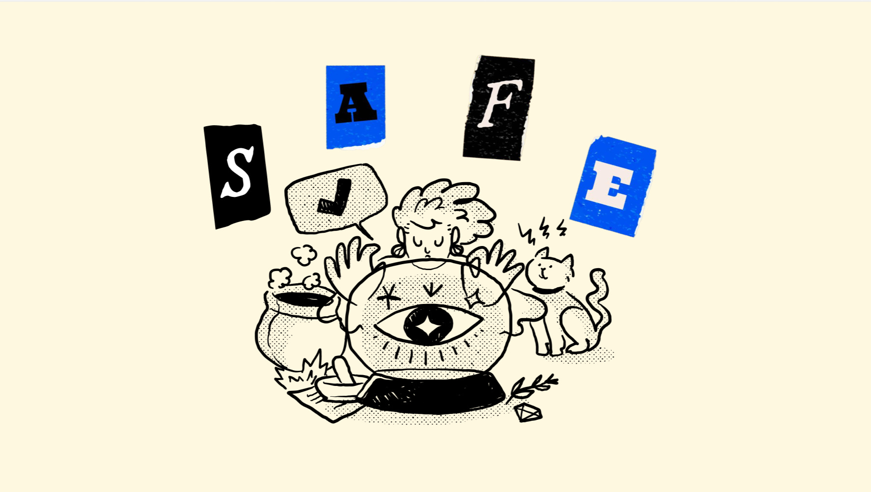
Introducing the SAFE Framework
After spending way too much time analysing a bunch of interfaces across industries, I identified four consistent patterns that I think anyone can use as foundations to build trust into their products. I call this the SAFE framework (yes, I know… but it kinda works):
S - Security Signals: Making safety visible instead of just claiming it exists by making it feel active and present during use
A - Authority Cues: Demonstrating competence through the product experience itself rather than just claiming credibility, by anticipating edge cases and covering complex scenarios
F - Familiarity Patterns: Using established conventions strategically during vulnerable moments to reduce cognitive load by knowing when to innovate vs when to conform
E - Empathy Moments: Meeting users where they are and providing appropriate reassurance by designing for the emotional context of your domain
When applied systematically, these four elements work together to create trust regardless of your industry or product type. Security Signals and Familiarity Patterns create positive gut reactions. Authority Cues satisfy analytical evaluation. Empathy Moments build emotional connection that leads to long-term trust.
Why SAFE Works Everywhere
The beauty of this framework is that its simplicity makes it universal. Sure, trust expression varies by context, but the underlying psychology doesn’t change.
Take e-commerce platforms - they may use Security Signals during checkout, Authority Cues in product recommendations, Familiarity Patterns in navigation, and Empathy Moments around purchase decisions.
Healthcare apps might need Security Signals around privacy, Authority Cues in medical accuracy, Familiarity Patterns in terminology, and Empathy Moments around health anxiety.
Very different application but still based on the same exact principles.
This framework also scales from simple landing pages to complex software because it's built on human psychology, not industry-specific features. Once you understand these four core elements, you've got a solid foundation to start building more trustworthy products.
What’s Next
Over the next couple of weeks, I'll break down each element of SAFE with real examples and suggestion on how to implement them across different industries.
But here's something you can try in the meantime: pick one critical moment in your user journey where trust is essential and ask yourself what might make users hesitate. Are there opportunities to add security signals? Maybe there's a familiar pattern you've overlooked, or perhaps you could show authority more clearly. Can you show more empathy in your design?
Chances are you'll find something :) but regardless, this can be your starting point to think more actively about how your products build trust.
This post is a companion piece to my talk Designing For Trust for the Friends of Figma World Tour event 👇
If you found this useful, share it with a fellow designer who’s struggling with user confidence or conversion issues. Trust design is something we can all get better at! What trust gaps have you noticed in your own products?